03. Tips for choosing right font for your posters
There is no better idea to attract someone’s attention than to make a poster. The bright and readable poster is a concentrated source of information. Besides, people easily comprehend visually designed information that is, posters are more effective than plain texts. At the same time, they are more informative than any image. As a result, posters and infographics are popular today among designers and marketers.
One of the most acute questions you may face when deciding to make a poster is how to choose a font. The question, let’s be sincere, is not limited just by the name of the font. There are lots of decisions you may need. How many fonts for infographics or posters will be OK? What fonts suit certain goals? Where to get them? Let’s get answers to all of them in this article!
Deciding on a Type of a Font
Even when you look at this text you can see that headings differ from the text itself to attract attention and concentrate it on certain information. The rightly chosen font for the poster works the same.
Maybe, you have already seen lots of samples of fonts used in visual design? At least, names like Times New Roman, Comic Sans, or Gothic are not unknown to you? Besides conventional fonts, there are lots of author types developed by designers. The choice can be hard but you can make it a bit easier.
Emotional Coloring of Fonts
First of all, let’s distinguish what type of emotions your poster will evoke in people? Will it be a warning or a funny content, informational, or made just for L.O.L? For example, let’s take a look at the picture below. What font transmits the emotion brighter? We can bet, you’ll feel fun from the right font, won’t you?

The same is with other types of fonts for posters you can use. Besides emotional coloring, fonts can also impact readability. Just like in the example below.

Even seriousness and importance depend on it.

Main Types of Fonts for Poster and Their Intention
Despite the many classifications of fonts, there are four main groups:
- Antiqua or so-called serif fonts;
- Grotesque aka sans-serif fonts
- Handwritten fonts imitating human handwriting
- Decorative fonts that are used for headings or logos
Serif fonts for poster look better when used in a long text. This refers to the fact that Antiqua fonts usually were used for newspaper headings.
Grotesque fonts are looking good on a screen. That’s why they majorly are associated with something from the digital epoch. Facebook’s logo is a brief example of that. There is also a simple tip for choosing a fonts for infographics or a poster. Just evaluate how readable it will be for a viewer on the screen and canvas. If both options are readable, it is bingo!
There is a solution on how to choose a font for a poster with ease. Make a poster in a special software like RonyaSoft Poster Designer and look at how certain fonts work with it. The scope of functions in software like that allows you to choose from a huge number of fonts for poster to get the best one. You can download Poster Designer and try to make a poster for free.
For an easier start, we suggest you read the articles that will help you make a poster using RonyaSoft poster software: How to make a poster from scratch, How to create a poster from template and How to design and print a poster
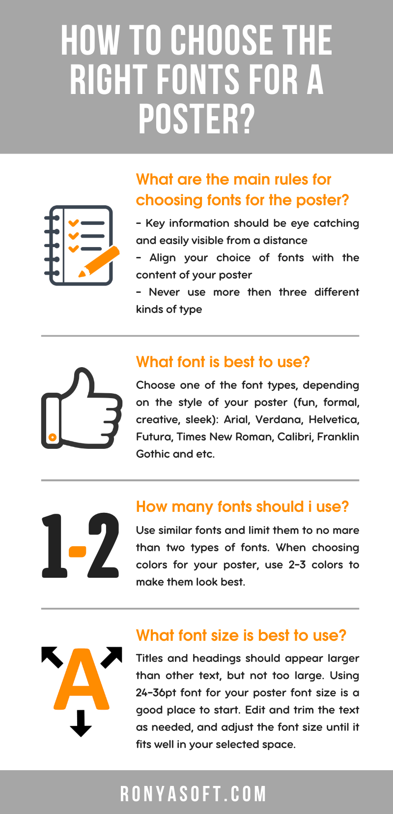
A Short Guideline on How to Choose Fonts for Infographics
To make long things short, there are simple infographics that fully expose the idea of how to choose a font and make a poster more attractive.
What Font Size to Choose for Posters
Now let’s concentrate on the size of the font. This should not be underestimated as the size impacts both readability and the amount of text you can place on a poster.
As usual, designers adhere to several rules about fonts sizes:
- The bigger the font size is, the better it will be read from different distances. For a poster, it is necessary to use fonts of a size that will be easily read from a distance of 1+ meters.
- Making contrasts in font sizes works. The more important information is, the bigger font is used for it. Do not forget about the hierarchy as with the size you can manage it. Besides the size, use effects, and bold or underlined font to express ideas.
- Do not make small intervals between text blocks. They will merge.
So here we come to the next question. How many fonts for infographics are needed?
How Many Fonts Can Be Used in One Poster?
To make a poster in one font is not the greatest idea. It may seem just boring. Instead, you can choose 2-3 fonts for headings, main information, and other blocks.
For example, you can use decorative font for the logo or heading text.
For the most informative part, take serif fonts. And for some appeal or additional information, the font can be even stylized.
Just use it to create a brilliant poster that will attract the attention and fully enclose the sense of the text by applying the most suitable fonts. Do you want to try all these tips right now? Start with the creation of a poster in RonyaSoft Poster Editor. This tool will help you to train your newly got skills and to evaluate the importance and effect each font provides when using it. Make brave solutions and let the font you choose work as you intend it to do.
Additionally, we want to invite you to read another article 5 rules to create an eye catching poster.