Editing object properties
To change object properties, select one or multiple objects at first.
The Properties Editor will display properties related to selected objects. With multiple objects selected, only shared properties will be shown.
If some properties at the bottom of the properties editor are not visible, use the  Up and
  Down buttons to move the editor panel in the appropriate directions.
Object properties are presented in the following sections:
- Text
- Font
- Alignment
- Arc
- Circle
- Corner Points
- Wave
- Image
- Metafile
- Recoloring
- Line
- Rounding
- Drawing
- Placement
- Effects
- Operation
- Background
- Background Collection
Text
For a general multiline text shape and for a single line special text shape different text sections available appropriately:
 |
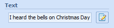 |
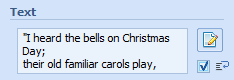
The Text section is used with Text objects.
To quickly edit the text of a Text object, enter it into the memo field.
To edit the text in the Text Editor, click the  Edit button. See Editing a text property for more info.
To allow wrapping of the text inside the shape's area, select  checkbox.
 Tip: Another way to edit the text is to double-click a Text object and edit it in-situ in the document.
Font
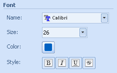 |
The Font section is used with Text objects.
To change a font, select one of the available items from the Font drop-down list.
 Tip: To quickly access a font you need, enter the first character of the font name with the Font list active.
To set a font size, select one of the predefined values in the Size drop-down list or enter your own value.
Note: Font size is real height of the text in millimeters on 100% scale. Font size/value includes internal leading.
To change a font style, use the Style buttons.
To set a font color, click the Color button and specify the color in the Color Editor. See Editing a color property for more info.
 Related topics:
Alignment
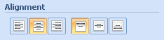 |
The Alignment section is used with Text objects.
To change horizontal and/or vertical text alignment, use the Alignment buttons.
Arc
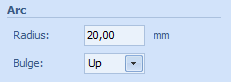 |
The Arc section is used with Arc Text objects.
To change the radius of the arc, enter your value in the Radius field.
To change the bulge orientation, select Down orientation or Up orientation in the Bulge drop-down list.
Circle
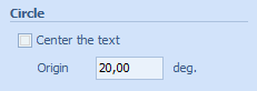 |
The Circle section is used with Circle Text objects.
To switch the center the text is on, select the Center the text checkbox.
To change the origin angle of the text, enter your value in degrees in the Origin field.
Corner Points
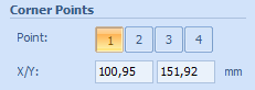 |
The Corner Points section is used with Perspective Text objects.
To select the top-left point of the text shape, click First button in Point properties.
To select the top-right point of the text shape, click Second button in Point properties.
To select the bottom-left point of the text shape, click Third button in Point properties.
To select the bottom-right point of the text shape, click Fourth button in Point properties.
To change the coordinates of the selected point, enter your values in the X and/or Y fields.
Note: Alternatively, you may move the corner handles of perspective text with the help of the mouse.
Wave
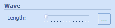 |
The Wave section is used with Wave Text objects.
To set the length of the Wave Text, use the Length slider.
Click the Options button to open Wave Dialog for setting additional properties.
To set additional properties of the wave, click the Options button. See Editing a wave property for more info.
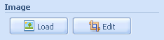
Image, Metafile
 |
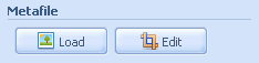 |
Image and Metafile sections are used with Image and Metafile objects.
To reload an image, click the Load button and specify an image in the Open Image dialog box. See Opening an image for more info.
To crop an image, click the Edit button and use the Image Editor for cropping. See Editing an image property for more info.
Note: Image and Metafile sections are similar. The first one is displayed for raster images, the second one for metafiles. Raster images can be replaced only by other raster images, metafiles only by metafiles.
Tip: Another way to reload an image is to double-click an Image object.
Related topics:
Recoloring
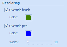 |
The Recoloring section is used with Metafile objects.
To switch the override brush on, select the Override Brush checkbox.
To set a color of an override brush, click the Color button and specify the color in the Color Editor. See Editing a color property for more info.
To switch the override pen on, select the Override Pen checkbox.
To set a color of an override pen, click the Color button and specify the color in the Color Editor. See Editing a color property for more info.
To set the width of the pen, use the Width slider.
Note: You may override only properties of the pens and brushes used using internal metafile commands. Two visually similar metafiles may be drawn using different techniques, e.g. utilizing only pens or only brushes. That's why sometimes graphics with overridden pens and brushes may looks strange.
Line
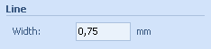 |
Line section is used with Line objects.
To set line width, enter the appropriate value into the Width field.
Rounding
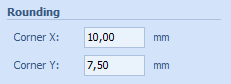 |
The Rounding section is used with Rounded Rectangle objects.
To specify the size of corners, enter your values in the Corner X and/or Corner Y fields.
Drawing
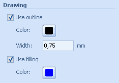 |
The Drawing section is used with polygon objects (lines, rectangles, or ellipses).
To switch the outline on, select the Use outline checkbox.
To set a color of an outline, click the Color button and specify the color in the Color Editor. See Editing a color property for more info.
To set the width of an outline, enter your value into the Width field.
To switch the filling on, select Use fill checkbox.
To define the color used for filling operations, click the Color button and specify the color in the Color Editor. See Editing a color property for more info.
Placement
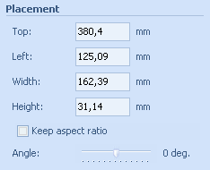 |
The Placement section is used with all kind of objects.
To set the top-left position of an object, enter appropriate values into the Top and/or Left fields respectively.
To set the size of an object, enter appropriate values into the Width and/or Height fields respectively.
Tip: See Customizing the application for more info about how to change measurement units.
To set up the shape size according to the size of the text, click the  button. This feature is available only for general text objects.
To keep proportions of an object when resizing, select the Keep aspect ratio checkbox.
Note: The image aspect ratio is set based on the original image size (or cropped image size in case the image is cropped). For other kinds of objects the aspect ratio is calculated and fixed when Keep aspect ratio checkbox is checked.
To set the angle of an object, use the Angle slider.
Effects
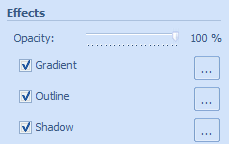 |
The Effects section is used with all kinds of objects.
To set the opacity of an object, use the Opacity slider.
To switch the gradient on, select the Gradient checkbox.
To set additional properties of the gradient, click the Options button and specify the gradient in the Gradient Editor. See Editing a Gradient effect properties for more info.
To switch the outline on, select the Outline checkbox.
To set additional properties of the outline, click the Options button and specify the outline in the Outline Editor. See Editing an Outline effect properties for more info.
To switch the shadow on, select the Shadow checkbox.
To set additional properties of a shadow, click the Options button and specify the shadow in the Shadow Editor. See Editing a Shadow effect properties for more info.
Operation
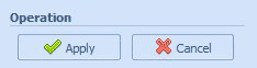 |
Click Apply button to complete editing operation.
Click Cancel button to cancel editing.
Background
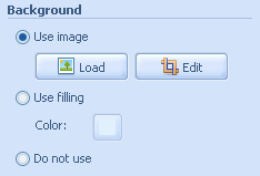 |
The Background section is used with background of the document.
To use an image as a background for a document, select Use image radio button.
To load (reload) a background image, click the Load button and specify an image in the Open Image dialog box. See Opening an image for more info.
If the loaded image aspect ratio differs from the document aspect ratio and the Keep Aspect ratio option is switched on, you will be prompted to crop the image to appropriate ratio. See Editing an image for more info.
Note: Only raster image formats ( bmp, jpg, png, gif) can be used for a background.
To crop a background image, click the Edit button to open the Image Editor. See Editing an image property for more info.
Note: The background image is fitted to the document size. If you would like to change the placement of the background image you need to:
- Disable background use;
- Add a new separate image;
- Sent it to back via the popup menu;
- Place the image the way you want it;
For a color background fill effect, select the Use filling radio button.
To set the filling color, click the Color button and specify the color in the Color Editor. See Editing a color property for more info.
To disable the background in a document, select Do not use radio button. White color filling will be used in this case.
Tip: Another way to edit a non-empty background is to double-click the document area.
Background Collection
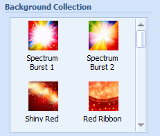 |
The Background Collection section is used for the background of the document.
To quickly choose a background image from the predefined collection, mouse-click on the thumbnail.
The image will be loaded as the background of the document. See Background section above for more info.
If the loaded image aspect ratio differs from the document aspect ratio and the Keep Aspect ratio option is switched on, you will be prompted to crop the image to the appropriate ratio. See Editing an image for more info.
Related topics: